
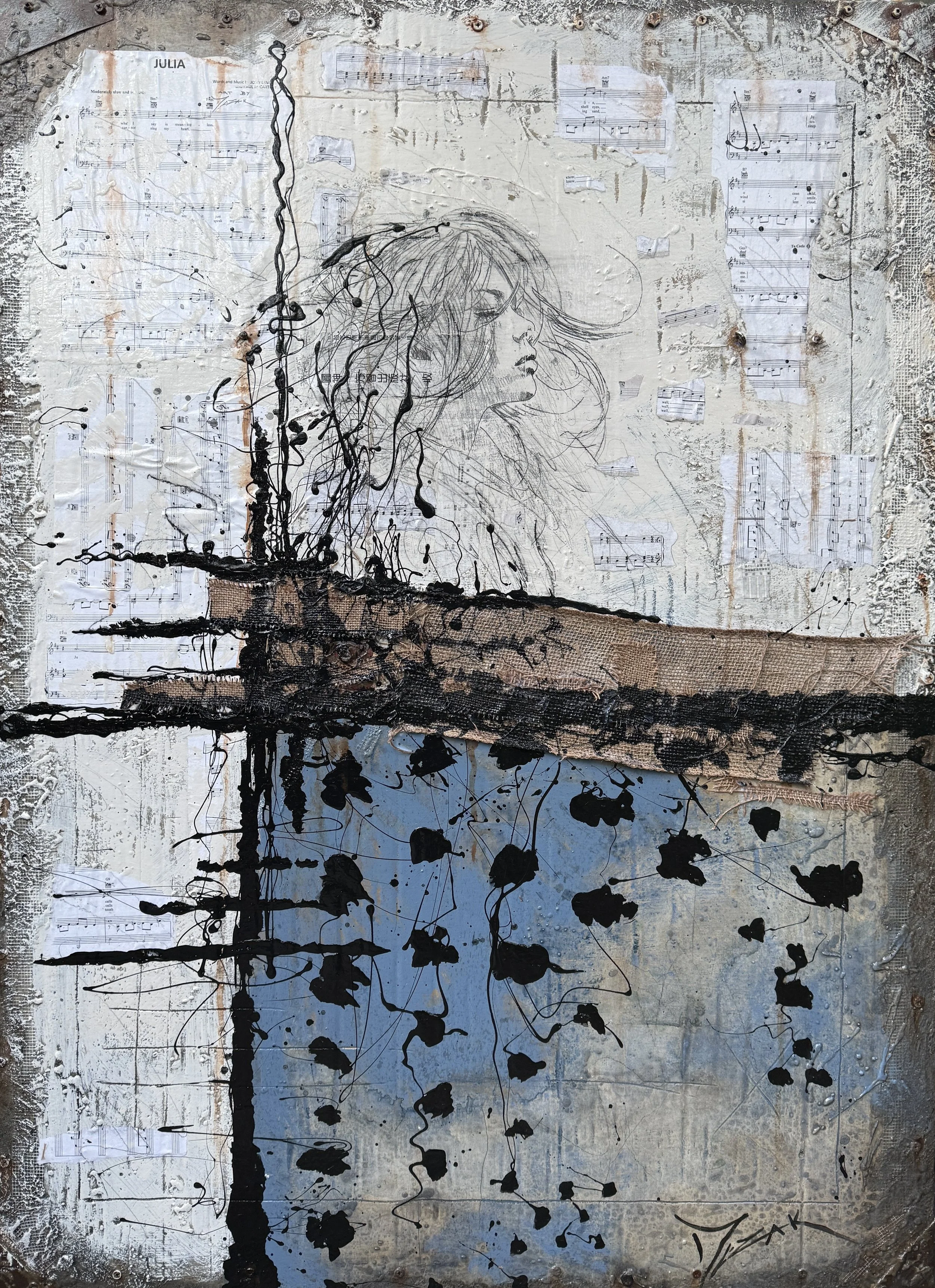
Julia
48” x 36”
SOLD
Julia, written and performed by John Lennon, was created as a heartfelt tribute to his mother, Julia Lennon, and appears on The Beatles (White Album). While listening to Julia, I began this piece without a clear figurative image in mind. As the song played, I started sketching the profile of a woman lost in deep thought. Layers of burlap and metal were added to create texture and depth, blending the figurative form into an abstract composition. Hidden subtly beneath the song title is the phrase “art by Mezak,” integrated into the piece as a personal signature within the work itself.
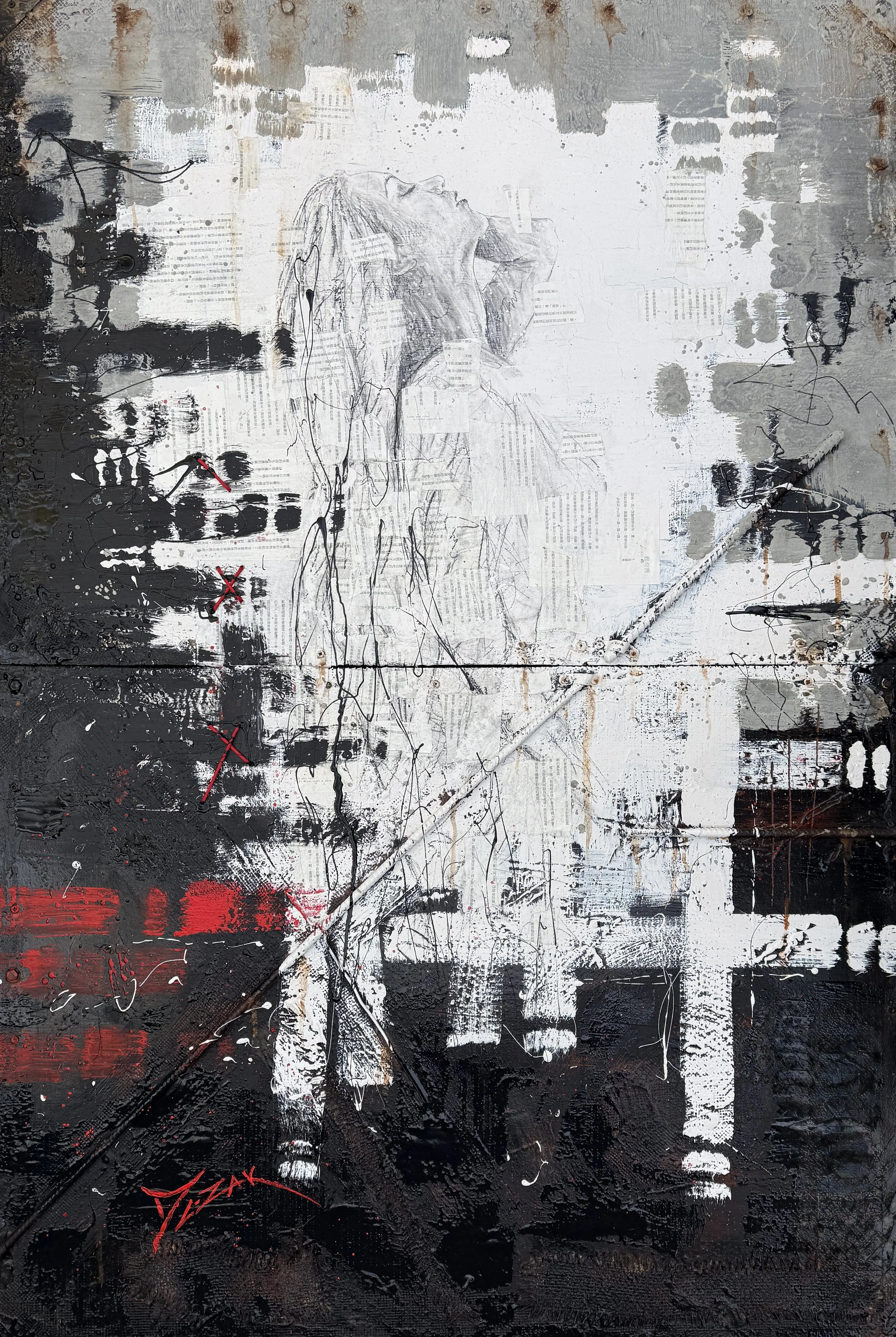
Can’t Buy Me Love
60” x 40”
I am drawn to painting figurative works, and clients often ask where my inspiration comes from. Music has always been a major influence on me, especially rock and roll. I love listening closely to the lyrics, trying to understand the deeper meaning, and learning the stories behind the music. The lyrics to Can’t Buy Me Love resonate with me because they speak to genuine love and the idea of falling in love for the right reasons, rather than for material things. Throughout the piece, subtle x’s and o’s are incorporated to symbolize hugs and kisses, while the use of red represents romance. Torn fragments of the lyrics to Can’t Buy Me Love are integrated into the piece.
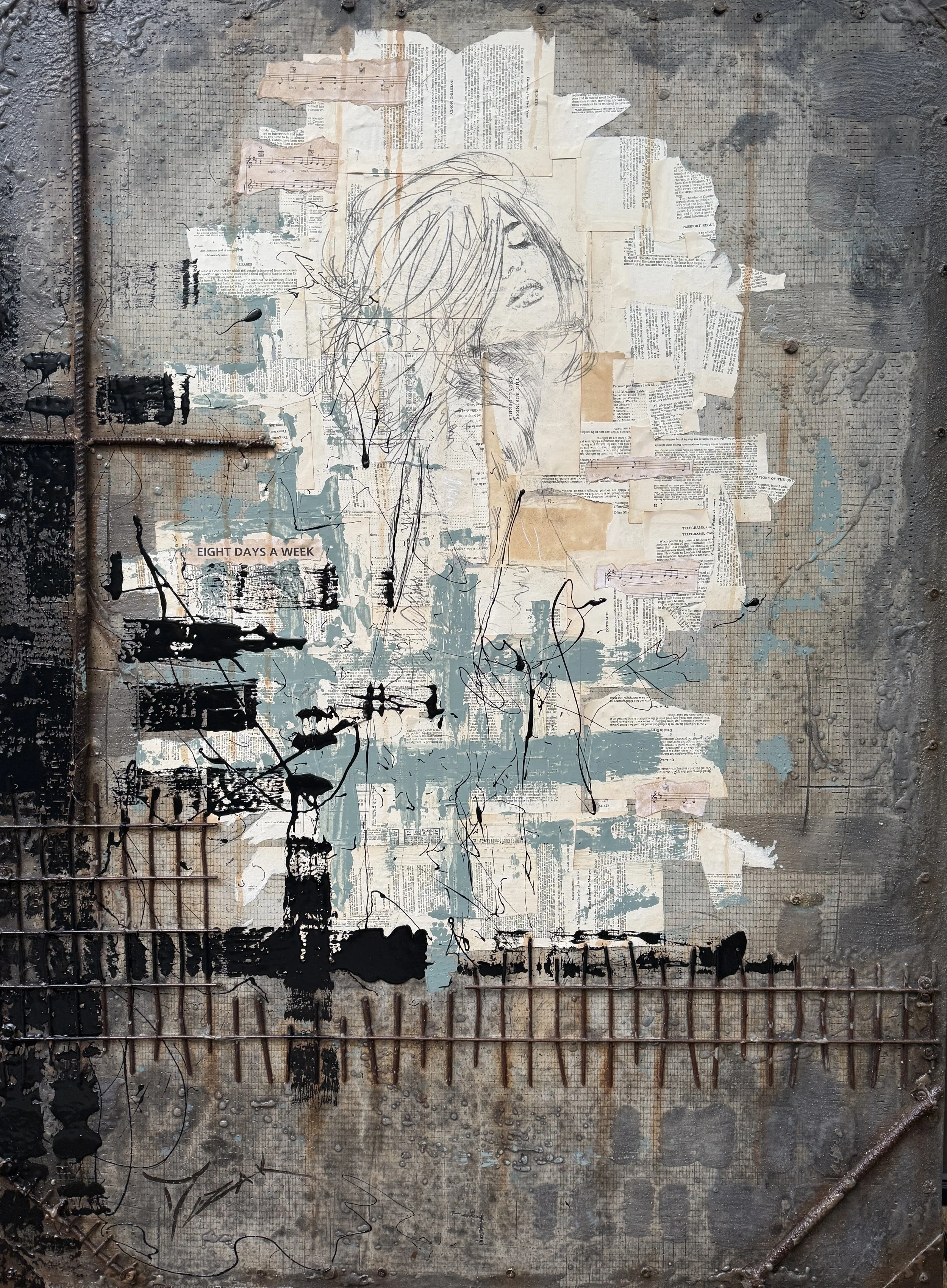
Eight Days a Week
48” x 36”
SOLD
Eight Days a Week was written after Paul McCartney asked his chauffeur how he was doing and he replied, “Working hard, working eight days a week.” This is the final piece created for the series and is the culmination of an ambitious and deeply personal project where I often felt as though I was working day and night. Out of all of the works in this series, I feel like this piece incorporated the techniques, risks, and lessons I’ve gathered throughout my career. Rather than overworking every detail, I intentionally allowed portions of the composition to remain raw and unfinished, embracing restraint and trusting the process. In many ways, this piece reflects a moment of growth — learning when to stop, when to let the materials speak for themselves, and when to finally leave the work as it is.
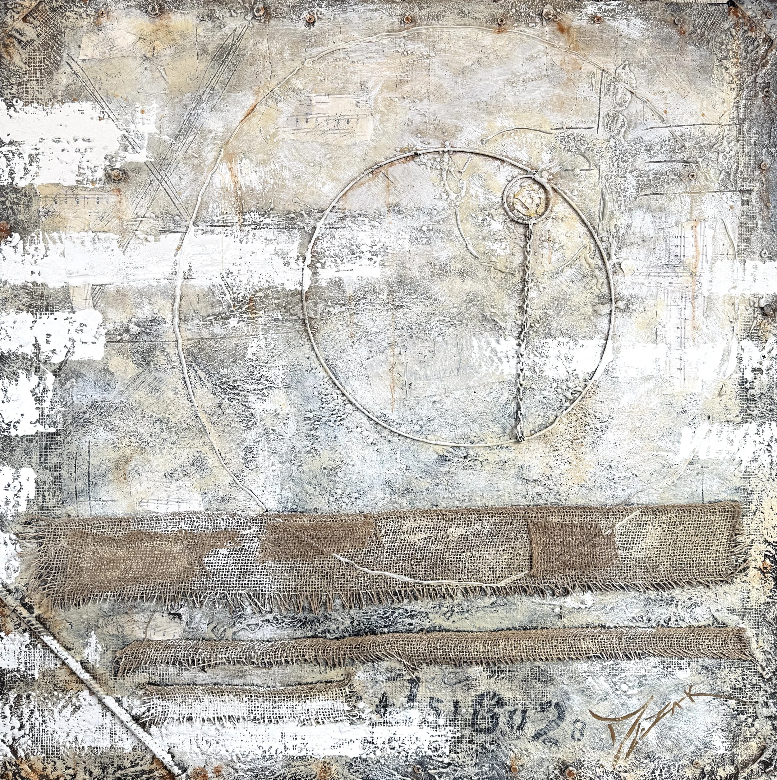
White
36” x 36”
This piece is a tribute to The Beatles (White Album), the self-titled 1968 release that became most famously known as the White Album. The stamped serial numbers on the original covers varied depending on where each album was pressed. John Lennon owned copy number one, which was later gifted to Ringo Starr. The leading “A” I featured in this piece references albums pressed in Los Angeles. As a kid, I remember my parents’ album started with the A. Like the album itself, this painting embraces minimalism while containing a depth within. From a distance, it appears to be a simple neutral surface, but closer inspection reveals heavy texture throughout the composition. The concentric rings are meant to resemble the impression left by a vinyl record resting inside its sleeve. In the upper right corner, a small hidden detail references the yellow “spider” adapter once used to play 45 RPM records, adding another nostalgic connection to the vinyl era.

Walk
40” x 30”
SOLD
Walk was the first piece created for this series though at the time, I didn’t have a vision for a complete collection. When I started working, I was listening to the album Abbey Road, so I added the iconic crosswalk to it. That moment sparked the idea to create the Come Together series based on the music of The Beatles. This piece sold prior to the show, but it remains included as the work that gave life to the entire series.
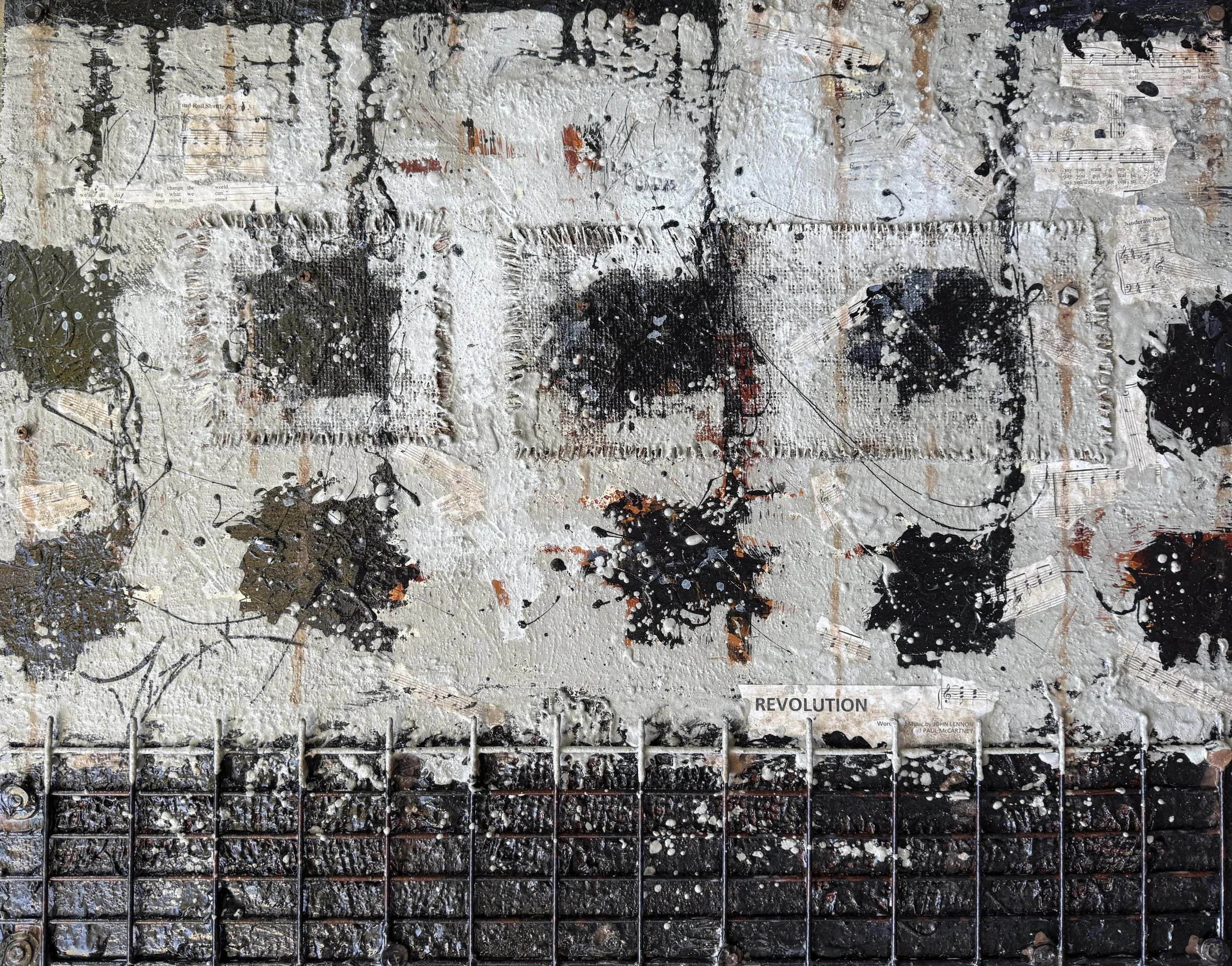
Revolution
24” x 30”
SOLD
Revolution by The Beatles became an iconic anthem of its era, shaped by the social unrest of the late 1960s, including the Civil Rights Movement and the Vietnam War. This abstract piece is inspired by my favorite part of the song - the heavy, distorted guitar introduction. The black notes are an extreme close-up of the opening guitar riff of Revolution. The metal caging is meant to represent the musical staff and serve as a visual connection between sound and structure.
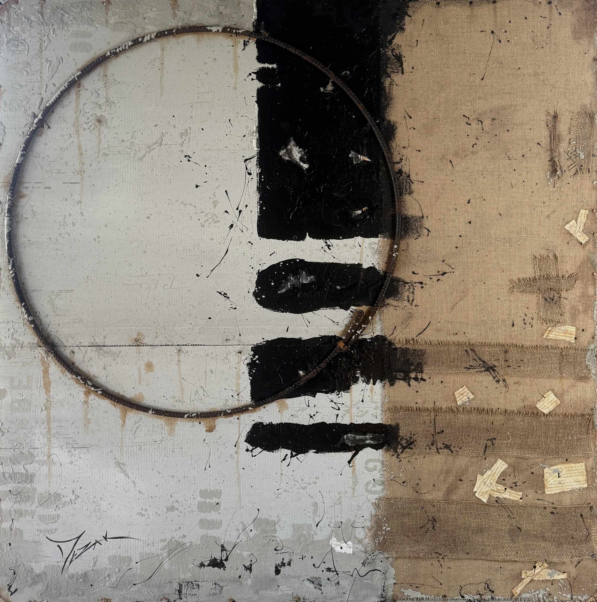
Abbey Road
60” x 60”
The album Abbey Road was released on September 26, 1969, as the band’s eleventh studio album in just over six years. This piece is loosely based on the iconic image of The Beatles crossing the famous Abbey Road crosswalk. I approached this work as if the Beatles commissioned me to create the album cover keeping a couple of keynotes in mind. The black and white lines reference the crosswalk outside Abbey Road Studios. I bent rebar into a circle to represent the vinyl record. Hidden throughout the piece are fragments of sheet music and lyrics from songs featured on the album. The concrete stenciled number “69” is a tribute to the year the album was released.
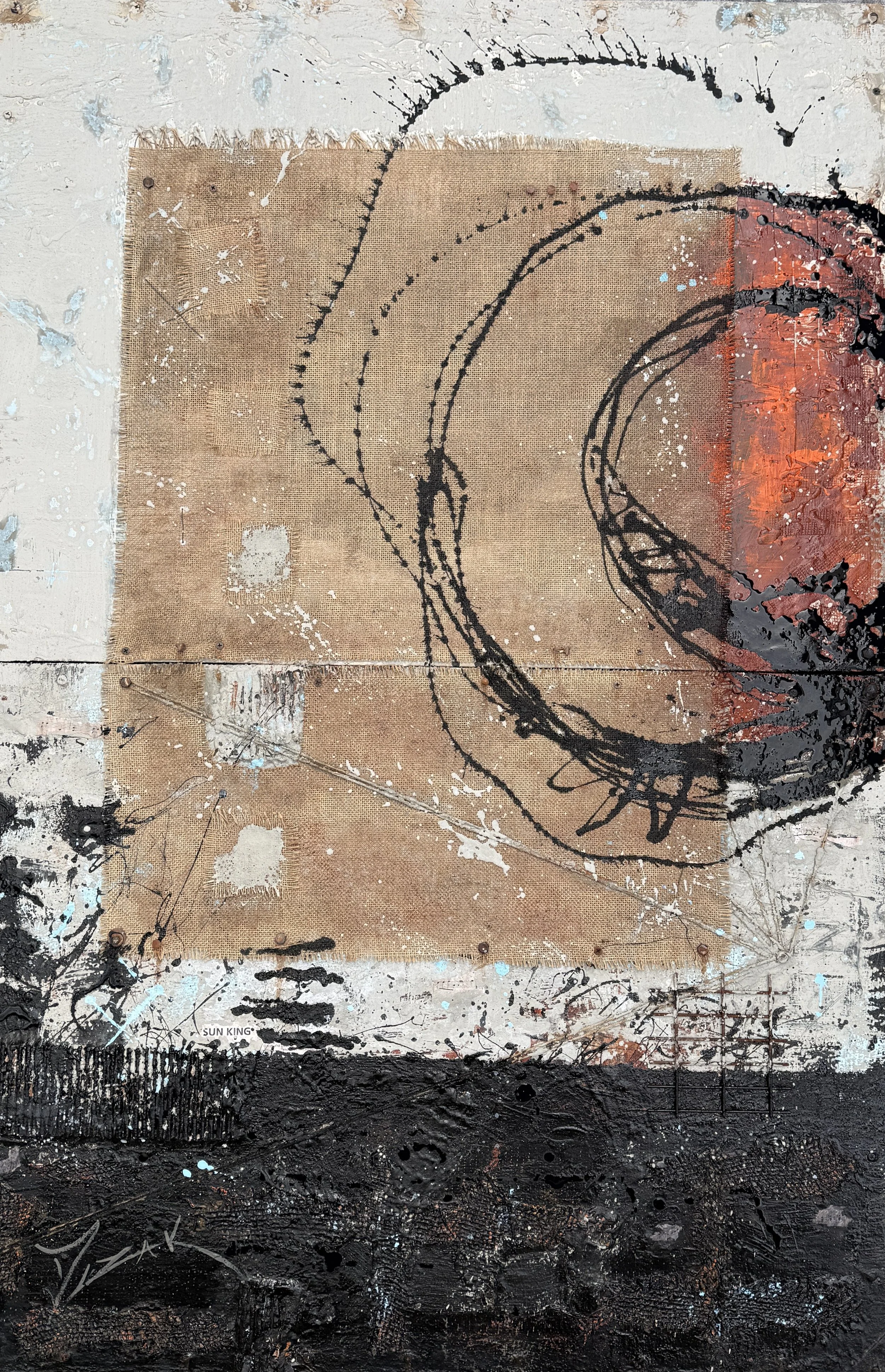
Sun King
60” x 40”
This abstract piece is based off the song Sun King, representing the sun rising over Abbey Road Studios. Along the lower portion of the piece, you’ll notice a series of black circles that suggest the silhouette of surrounding buildings, while four black lines reference the Abbey Road crosswalk. On the lower right side, the metal gridwork symbolizes Abbey Road Studios itself, grounding the abstract composition in the historic setting.
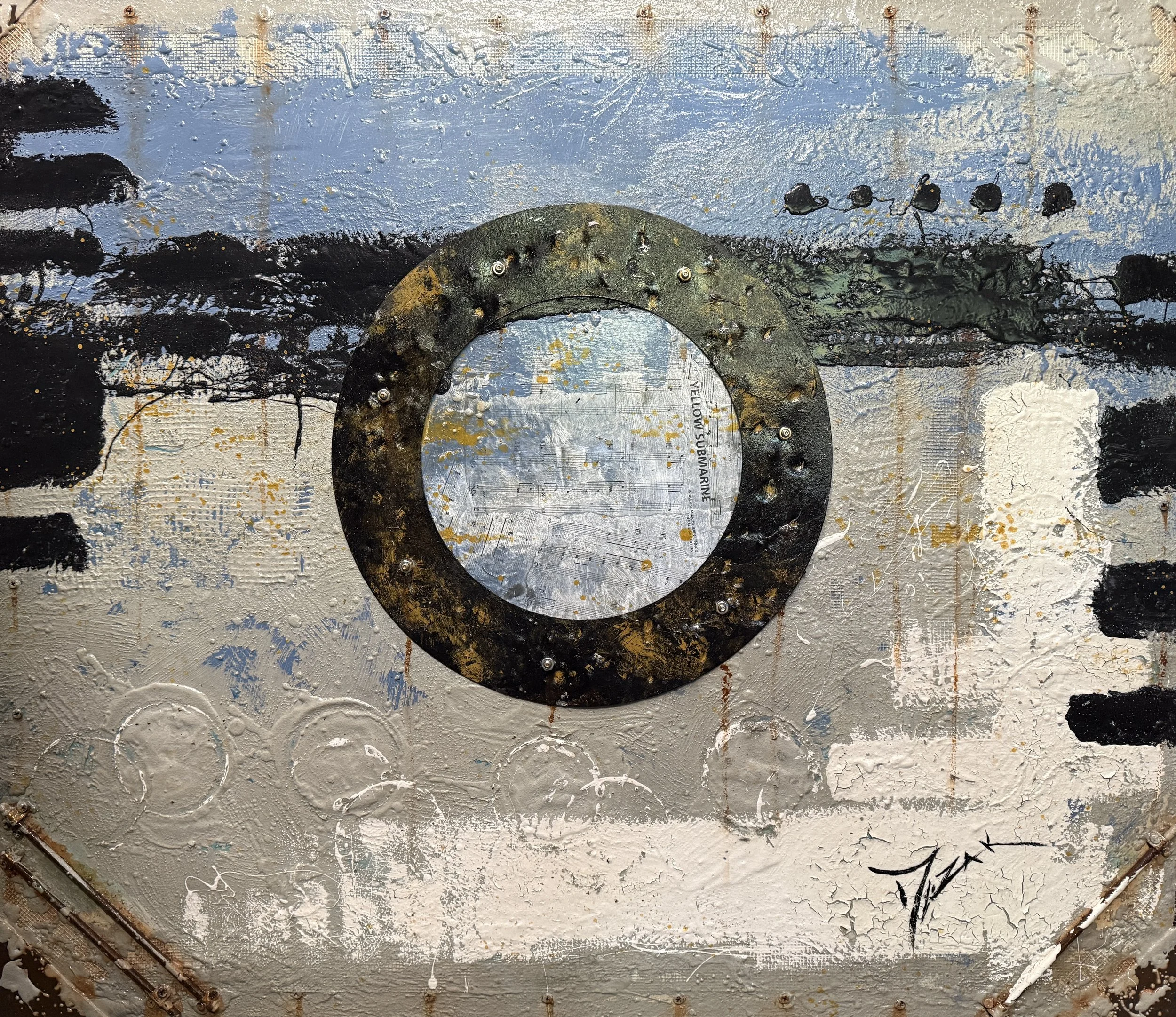
Yellow Submarine
36” x 42”
SOLD
Yellow Submarine is my interpretation of The Beatles’ iconic submarine as it might appear today — nearly thirty years later — resting in dry dock, weathered and forgotten, with its faded yellow paint stripped away by time as it reflects on its glory days. Screws and rivets are added throughout the composition alongside a reclaimed section of bonderized steel that I hand-hammered to suggest a vessel shaped and worn by decades at sea. The steel at the center of the work serves as the submarine’s porthole with fragments of lyrics from the song embedded inside, tying the industrial textures of the piece back to the nostalgia and imagination of the song.
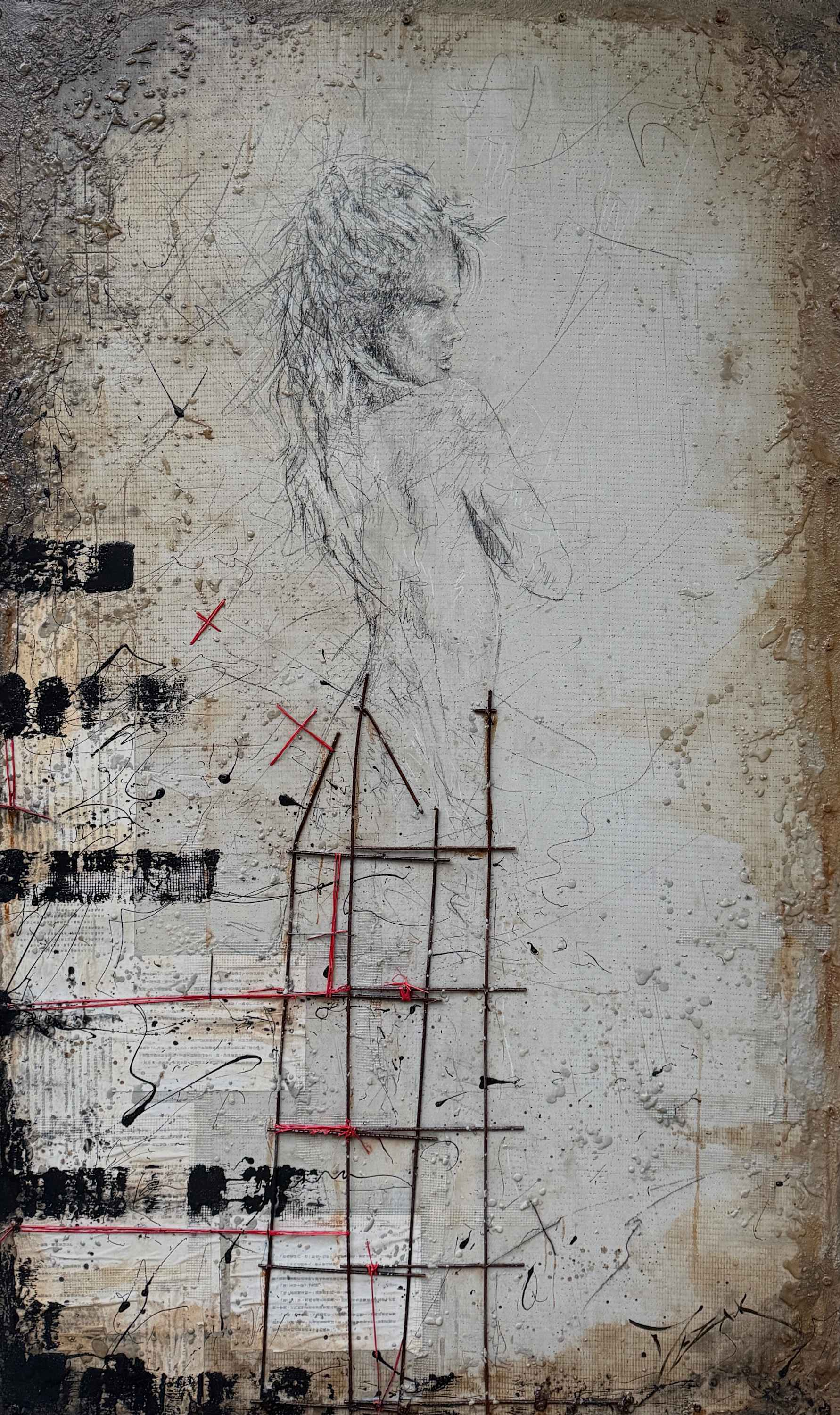
Oh Darling
60” x 36”
Oh Darling was written as a desperate plea for a lover to stay. When creating this figure, I wanted her expression to capture a sense of uncertainty for the fragile future of the relationship as described in the song. The red x’s woven throughout the composition symbolize love and affection. The painting began with softness as I drew the figure in charcoal. Then as the drawing comes down the back to the dress, I discarded the charcoal and switched to metal to mirror the emotional shift within the piece. In the lower left portion of the painting, the black linear elements are another hint of the Abbey Road crosswalk.